Creating Your First Landing Page Template in Bootstrap
Bootstrap has long been one of the most popular frameworks for frontend developers. The primary reason behind its popularity is the fact that Bootstrap is very easy to use for newbie developers. In fact, we can put together a Bootstrap template in no time and even with very limited coding skills. All we need to know is some basic HTML and CSS.
This is made possible due to the fact that Bootstrap comes with its own rich set of classes and methods, that can make frontend web development a walk in the park.
In this article, we will be building a landing page template using Bootstrap. So without wasting any more time, let us get started.
Building Our First Bootstrap Template
We will be using Bootstrap 4 to build a landing page template. It will be basic, but fully responsive and we will also add some eyecandy elements along the way.
To get started, we can make use of any existing boilerplate template or a skeleton template. In fact, the Bootstrap website itself has many such examples. However, we will not be relying on any of that. Instead, let us get started from scratch.
Here is what an empty Bootstrap page generally looks like. Notice that it contains, amidst all the metadata and markup, just one heading -- Hello world, meet Buddy!
html<!DOCTYPE html>
    <html>
    <head>
        <meta charset="utf-8">
        <meta http-equiv="X-UA-Compatible" content="IE=edge">
        <title>Building Your First Bootstrap Template | Buddy.works</title>
        <meta name="description" content="Building Your First Bootstrap Template by Buddy">
        <meta name="viewport" content="width=device-width, initial-scale=1">
        <meta name="robots" content="all,follow">
        <!-- Bootstrap CSS-->
        <link rel="stylesheet" href="https://cdnjs.cloudflare.com/ajax/libs/twitter-bootstrap/4.1.3/css/bootstrap.min.css">
        <!-- Custom stylesheet - for your changes-->
        <link rel="stylesheet" href="css/custom.css">
        <!-- Tweaks for older browsers-->
            <script src="https://oss.maxcdn.com/html5shiv/3.7.3/html5shiv.min.js"></script>
            <script src="https://oss.maxcdn.com/respond/1.4.2/respond.min.js"></script><![endif]-->
    </head>
    <body>
        <h1>Hello world, meet Buddy!</h1>
        <!-- JavaScript -->
        <script src="https://cdnjs.cloudflare.com/ajax/libs/jquery/3.3.1/jquery.slim.min.js"></script>
        <script src="https://cdnjs.cloudflare.com/ajax/libs/twitter-bootstrap/4.1.3/js/bootstrap.bundle.min.js"></script>
    </body>
</html>
In the above example:
● We have included Bootstrap stylesheet as well as our custom stylesheet.
● We have added the meta name="viewport" tag for responsiveness.
● We have included the minified version of Bootstrap JavaScript.
Here is what our template currently looks like:
Image loading...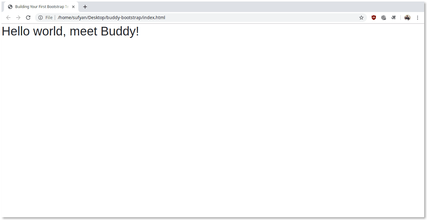
Adding Navigation
Our next step is to add a navbar to our template. The good part is that we do not have to manually code everything as Bootstrap comes with its own navigation component. As such, we only need to refer to Bootstrap navbar component. It is fully responsive and comes with a lot of customizable features.
Let us use the following code:
html<!-- navbar-->
        <nav class="navbar navbar-light navbar-expand-lg fixed-top shadow-sm bg-white"><a href="index.html" class="navbar-brand">Buddy with Bootstrap</a>
        <button type="button" data-toggle="collapse" data-target="#navbarSupportedContent" aria-controls="navbarSupportedContent" aria-expanded="false" aria-label="Toggle navigation" class="navbar-toggler"><span class="navbar-toggler-icon"></span></button>
        <div id="navbarSupportedContent" class="collapse navbar-collapse">
        <ul class="navbar-nav ml-auto">
            <li class="nav-item"><a href="#" class="nav-link">Home</a></li>
            <li class="nav-item"><a href="#" class="nav-link">About</a></li>
            <li class="nav-item"><a href="#" class="nav-link">Contact</a></li>
        </ul>
            <div class="navbar-text ml-lg-3">
            <a href="#" class="btn btn-primary text-white shadow">Fancy Button</a>
            </div>
        </div>
        </nav>
In the above code:
● We are referring to Bootstrap classes for navbar behavior when expanded or collapsed (depending on viewport size)
● We are using the Bootstrap-defined navbar-light skin.
● We have fixed the navbar to the top of the screen.
● We have added some menu links as well as a button, albeit none of this will work because we have not defined any proper link.
Here is what our navbar should look like:
Image loading...
Adding a Hero Section
Now, let us add a hero section right under the navbar. Since it is a landing page, our hero section must contain a catchy phrase as well as a call to action button or two.
Here is what our code will look like:
html<!-- Hero Section-->
        <section class="bg-light">
            <div class="container">
                <div class="row">
                    <div class="col-lg-6 order-2 order-lg-1">
                        <h1>Bootstrap Template by Buddy</h1>
                        <p class="lead">This is where our catchy phrase should come! Lorem Ipsum dolor sit amet. Lorem Ipsum dolor sit amet. </p>
                        <p class="lead">Lorem Ipsum dolor sit amet. Lorem Ipsum dolor sit amet. </p>
                        <p class="lead">Lorem Ipsum dolor sit amet. Lorem Ipsum dolor sit amet. </p>
                        <p><a href="#" class="btn btn-primary shadow mr-2">Learn More</a><a href="#" class="btn btn-outline-primary">An extra button</a></p>
                    </div>
                <div class="col-lg-6 order-1 order-lg-2"><img src="img/fancyimage.jpg" alt="landing image" class="img-fluid"></div>
            </div>
        </div>
        </section>
In the above example:
● The entire hero section has been wrapped in one element.
● We have made use of Bootstrap classes, such as img, lead and more. The lead class helps us add paragraphs, while the btn-primary lets us add primary buttons.
● We have also used a variant of the btn-primary class to add an outline button.
● We have made use of the Bootstrap grid structure to define our viewport rules.
Here is what our page now looks like:
Image loading...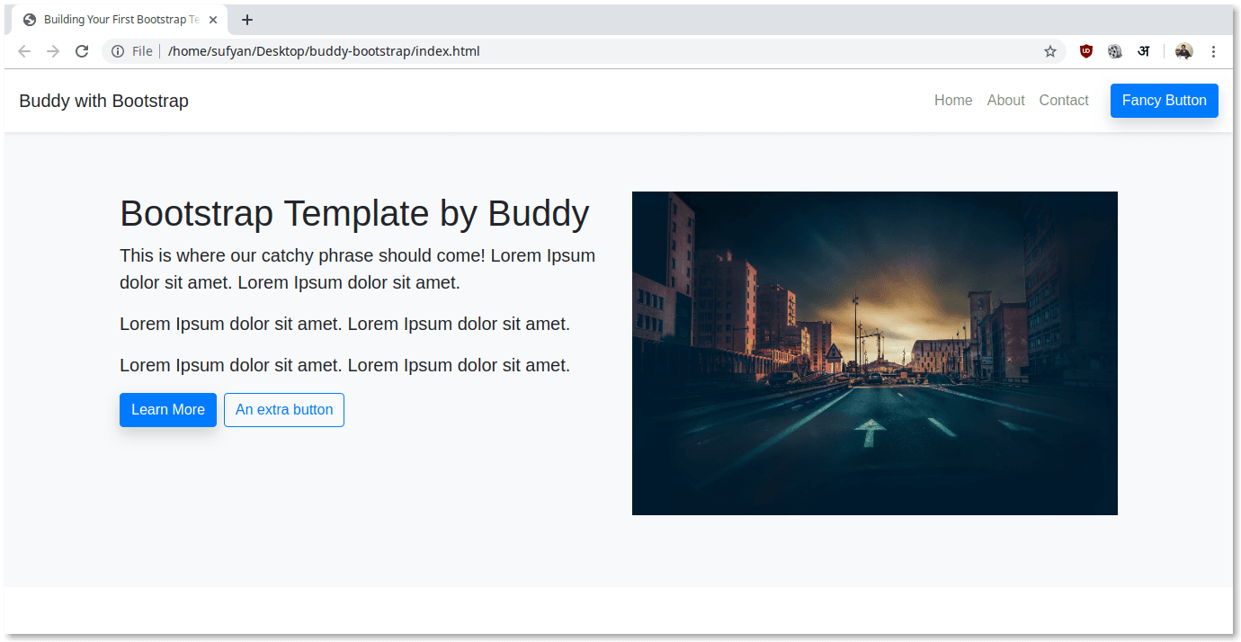
Adding Sub-Section
For our first sub-section, we can use the following code:
html<!-- Services-->
        <section>
            <div class="container">
                <h2>What We Do?</h2>
                <p class="text-muted mb-5">A sub-heading should come here :)</p>
                <div class="row">
                    <div class="col-sm-6 col-lg-4 mb-3">
                        <svg class="lnr text-primary services-icon">
                            <use xlink:href="#lnr-heart"></use>
                        </svg>
                        <h6>Tempor aute occaecat</h6>
                        <p class="text-muted">Tempor aute occaecat pariatur esse aute amet.</p>
                    </div>
                    <div class="col-sm-6 col-lg-4 mb-3">
                        <svg class="lnr text-primary services-icon">
                            <use xlink:href="#lnr-inbox"></use>
                        </svg>
                        <h6>Tempor aute occaecat</h6>
                        <p class="text-muted">Tempor aute occaecat pariatur esse aute amet.</p>
                    </div>
                    <div class="col-sm-6 col-lg-4 mb-3">
                            <svg class="lnr text-primary services-icon">
                                <use xlink:href="#lnr-rocket"></use>
                            </svg>
                            <h6>Tempor aute occaecat</h6>
                            <p class="text-muted">Tempor aute occaecat pariatur esse aute amet.</p>
                    </div>
          </div>
          <div class="row">
                <div class="col-sm-6 col-lg-4 mb-3">
                    <svg class="lnr text-primary services-icon">
                        <use xlink:href="#lnr-inbox"></use>
                    </svg>
                    <h6>Tempor aute occaecat</h6>
                    <p class="text-muted">Tempor aute occaecat pariatur esse aute amet.</p>
                </div>
                <div class="col-sm-6 col-lg-4 mb-3">
                    <svg class="lnr text-primary services-icon">
                        <use xlink:href="#lnr-rocket"></use>
                    </svg>
                    <h6>Tempor aute occaecat</h6>
                    <p class="text-muted">Tempor aute occaecat pariatur esse aute amet.</p>
                </div>
                <div class="col-sm-6 col-lg-4 mb-3">
                        <svg class="lnr text-primary services-icon">
                            <use xlink:href="#lnr-heart"></use>
                        </svg>
                        <h6>Tempor aute occaecat</h6>
                        <p class="text-muted">Tempor aute occaecat pariatur esse aute amet.</p>
                </div>
      </div>
        </div>
      </section>
In the above example:
● We are using Bootstrap classes to define containers, rows and columns.
● We have added six sub-items, in two rows.
● We have added a special classes to specify the end margin.
● We have used the text-muted class to apply a grey-ish color on text elements.
● Icon credits: https://linearicons.com/free#cdn
Here is what the section looks like:
Image loading...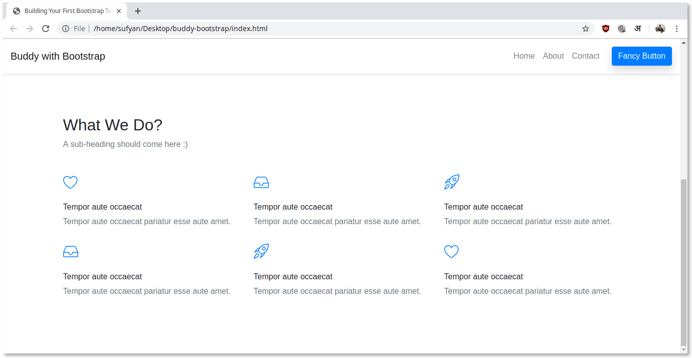
Adding Another Sub-Section
We can add sub-sections to our landing page using the above example. Let us add a quote section:
html<section>
            <div class="container">
                <blockquote class="blockquote text-center mb-0">
                    <svg class="lnr text-muted quote-icon pull-left">
                        <use xlink:href="#lnr-mustache"> </use>
                    </svg>
                    <p class="mb-0">Knowledge is Power. ^_^</p>
                        <footer class="blockquote-footer">Francis Bacon, in
                            <cite title="Source Title">Meditationes Sacrae (1597)</cite>
                        </footer>
                </blockquote>
            </div>
        </section>
In the above example:
● We have used the blockquote class to add the quote.
● We have again used Linear Icons for the icon.
Here is what it looks like:
Image loading...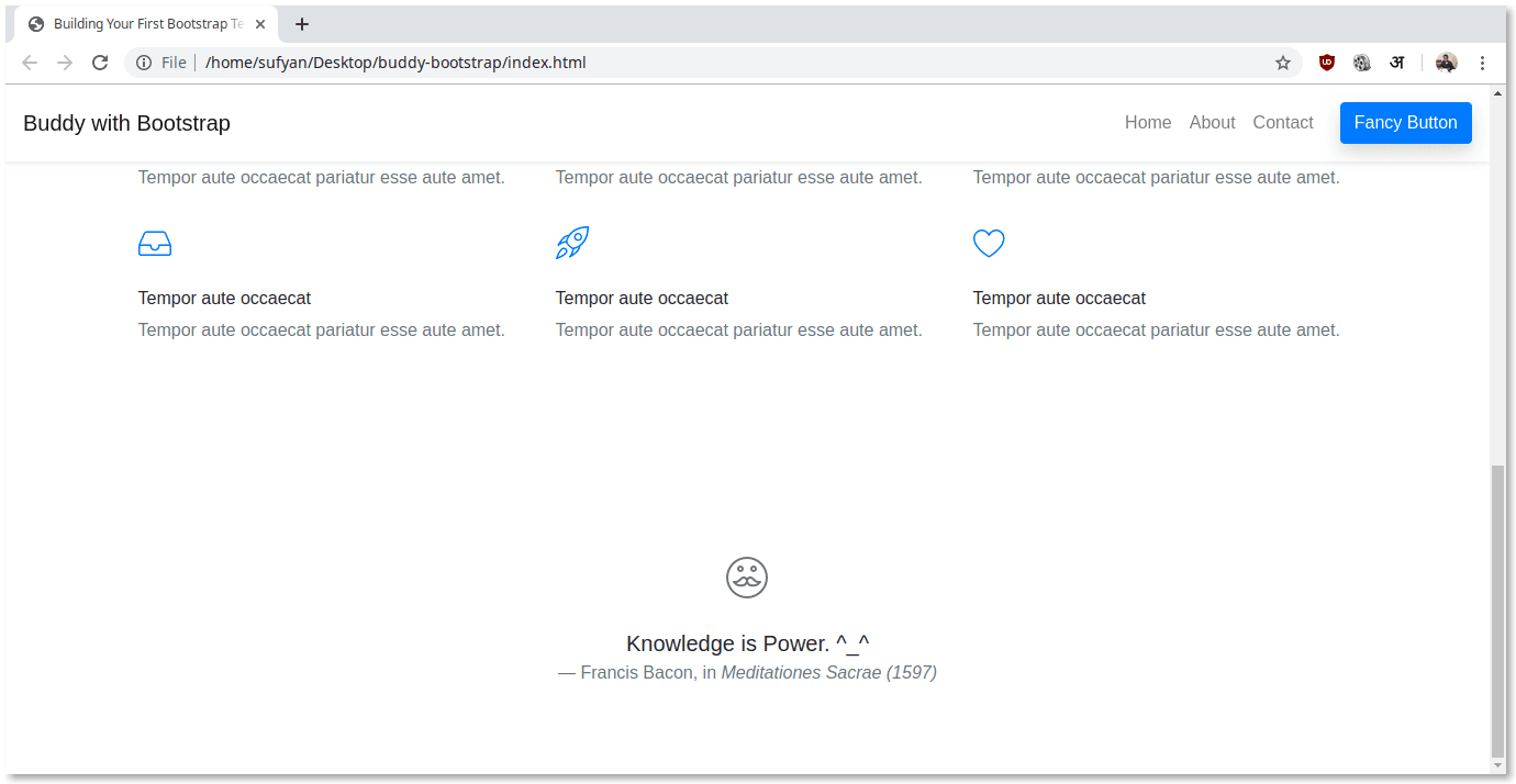
Adding the Footer
Lastly, let us now add a footer to our landing page. Adding a footer is a fairly easy process, as all we have to do is use basic HTML with some styling to add links, information, etc.
html<!-- Footer-->
        <div class="py-5 bg-light">
            <div class="container">
                <div class="row">
                    <div class="col-lg-4 mb-4 mb-lg-0">
                    <h5>Bootstrap 101</h5>
                        <ul class="contact-info list-unstyled">
                            <li><a href="#" class="text-dark">hello@buddy.works</a></li>
                            <li><a href="#" class="text-dark">+00 000 00 000</a></li>
                        </ul>
                    <p class="text-muted">Some very vital disclaimer comes here.</p>
                    </div>
                <div class="col-lg-4 col-md-6">
                    <h5>Information</h5>
                        <ul class="links list-unstyled">
                            <li> <a href="#" class="text-muted">My Amazing Link</a></li>
                            <li> <a href="#" class="text-muted">My Amazing Link</a></li>
                            <li> <a href="#" class="text-muted">My Amazing Link</a></li>
                            <li> <a href="#" class="text-muted">My Amazing Link</a></li>
                        </ul>
                </div>
                <div class="col-lg-4 col-md-6">
                    <h5>More Info</h5>
                        <ul class="links list-unstyled">
                            <li> <a href="#" class="text-muted">My Amazing Link</a></li>
                            <li> <a href="#" class="text-muted">My Amazing Link</a></li>
                            <li> <a href="#" class="text-muted">My Amazing Link</a></li>
                            <li> <a href="#" class="text-muted">My Amazing Link</a></li>
                        </ul>
                </div>
            </div>
        </div>
    </div>
    <div class="py-3 bg-dark text-white">
        <div class="container">
            <div class="row">
                <div class="col-md-7 text-center text-md-left">
                    <p class="mb-md-0">(C) 2019 Buddy Corp. All rights reserved. </p>
                </div>
                <div class="col-md-5 text-center text-md-right">
                    <p class="mb-0">Bootstrap Landing Page by <a href="#" class="external text-white">Sufyan</a> </p>
                </div>
            </div>
        </div>
    </div>
In the above example:
● We have used several utility classes in Bootstrap, such as py- and mb- to add padding and responsiveness.
● We have added simple links to the footer as well as some copyright text.
Here is what our footer looks like:
Image loading...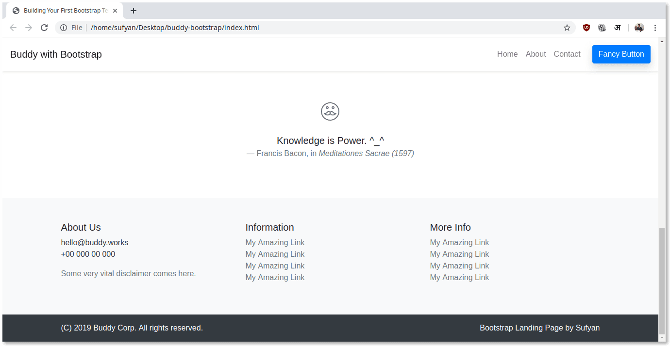
Conclusion
We have finished building our first-ever Bootstrap landing page. We will add some custom CSS to our template in order to make sure everything is in order.
Here is the final look:
Image loading...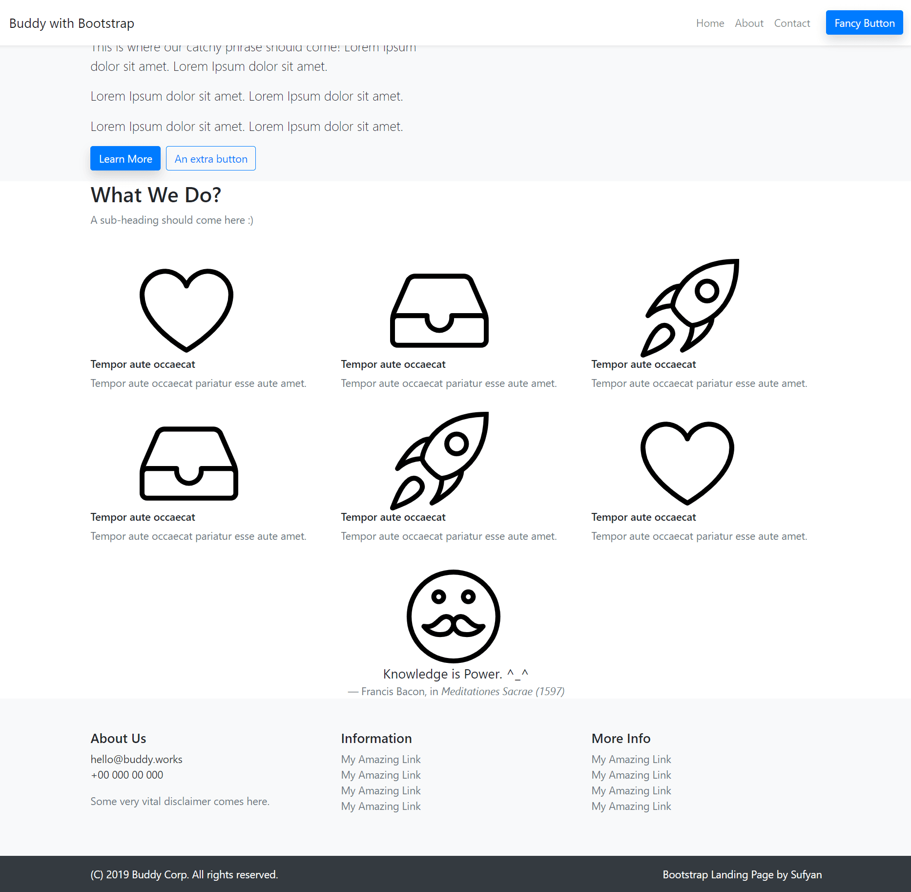
As you might have seen, using Bootstrap can save a good deal of time as we can repeatedly refer to its classes and properties. As such, we do not have to manually specify every design element all the time. So go ahead, give Bootstrap a spin, and see what it can do for your projects!